Easy, Breezy, Bold & Beautiful Branding
Friday, February 28, 2020 - Joe Kiedinger
Rebranding is a daunting task for any designer; as well as a process most business owners are reluctant to go through. A logo and visual brand means something to a business owner. It’s a personal choice they made years ago, and whether they know it or not, it has an emotional hold on them.
Prophit Co. has recently redefined what and who we are as a company. We made a conscious effort to change how we present ourselves—though we haven’t changed what we offer to our clients. We made a deliberate decision to put the necessary time into building an updated brand for ourselves that will take us far into the future.
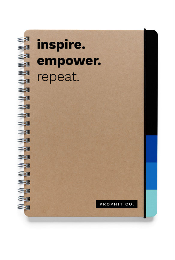
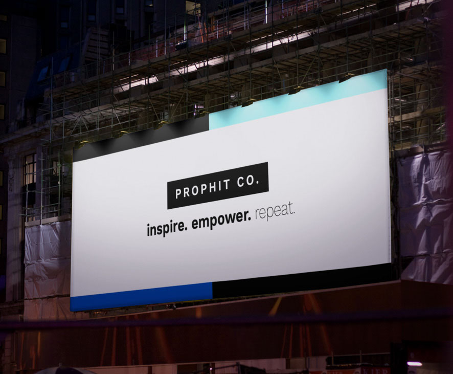
The goals we had for our logo were to stand the test of time, easily translate to many different applications and showcase simplicity. As pages and pages of logos were worked through, there was one common element that we kept coming back to… the first design that was created (isn’t it always that way?!). A simple black and white logo of our name placed within a black rectangle. It can stand alone but it also plays well with other graphic elements that emerged as we moved through the creative process.

We knew our new branding had to be bold, vibrant and had to speak to both influencers and decision makers. It had to speak with a new energy yet have a calm and trustworthy feeling.
With our knowledge of color psychology and a Pantone Color Book in hand, we pulled out a variety of blue hues to represent trust, peace, reliability and honesty.
Once the main elements of our brand were set and approved, we really started to play. Stepped gradations and checkmark designs emerged as main elements. And white space—oh the white space we now have to play with! What a joy. Everything we had with our previous logo on it needed to be updated, reimagined and reborn. Watching our designers take that and really run with it, will forever be a moment I, as the Art Director, hold with me. Seeing the idea I had turned into a full, robust and dynamic visual brand, was something magical to experience.
Having a brand that energizes a company, its owners and its employees is something we wish every company to experience. That’s why, when we work with our clients, we make sure their unique purpose is incorporated in every piece of their marketing. It’s how we ensure their marketing reflects who they truly are, deep down, as a company. We exist to give people credit for what they do because of who they are, and our new brand does just that. It’s poised to propel us to unknown heights and exude confidence in our abilities, with the added bonus of instilling confidence in our clients and contacts.
This daunting rebranding experience has truly reenergized our company. But, at the end of the day, the visual brand is only one aspect of Prophit Co. The second, equally important part, is our team. If you have the right people and the right visual brand, there is no limit to what you can do!


